{{w.note.date}}
{{w.note.title}}
{{w.note.invite.text}}
{{w.note.invite.label}}- {{b.title}}{{b.author}}{{b.year}}
{{t.text}}
- {{it.n}}{{it.text}}


Redesign for a global Web3 media platform
Turned a homepage nobody used into the entry point to the company's products, and the layout is still live today.
The CEO asked to turn the homepage into a product showcase. It had 5.6M visits against 77M on the news section, and heatmaps showed the products the company had built were invisible: the promo button in the hero got zero clicks.
77M
visits to the news section
5.6M
visits to the homepage
0
clicks on the hero promo
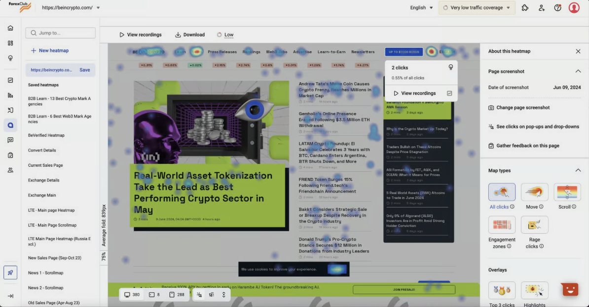
Heatmap of the old homepage
Existing research plus new interviews showed two groups with almost nothing in common.
Overwhelmed by crypto. Needs structure and a calm place to start.
Scans headlines fast. If something isn't immediately visible, it doesn't exist.
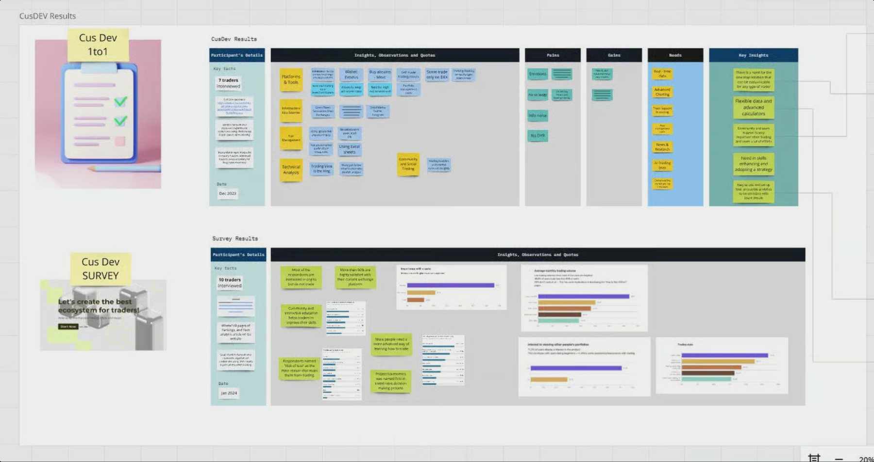
CusDev results: 1:1 interviews and survey
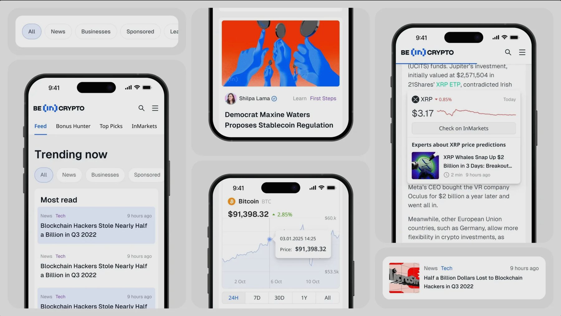
Readers scan headlines the way they scroll Twitter. So the homepage became an infinite news feed with product blocks woven in between: the content they already want, with the rest of the ecosystem surfacing as they scroll.
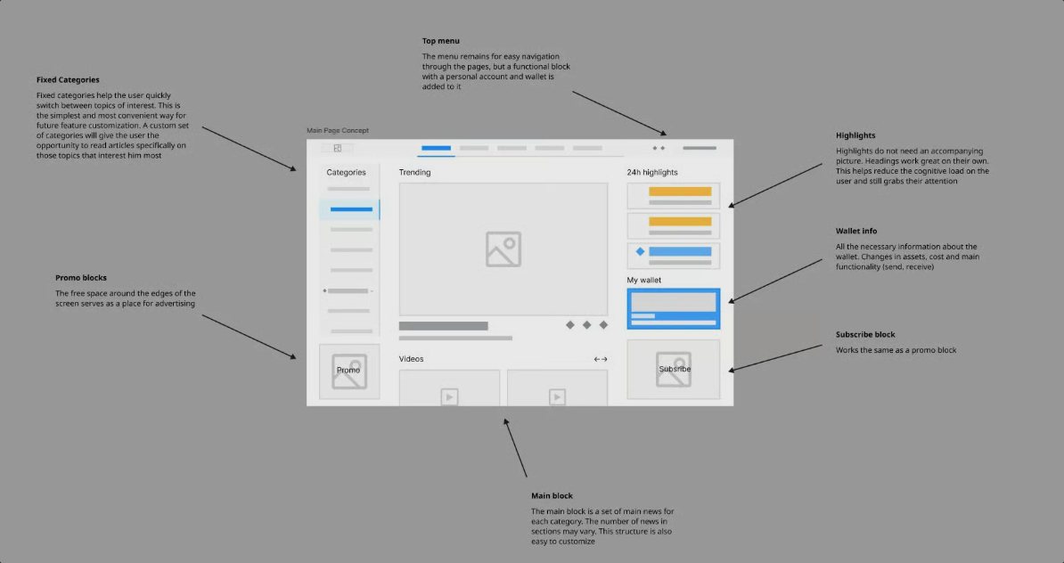
The feed with product blocks between articles
Version 1 kept the homepage and the feed as separate pages. In testing, users still skipped the homepage. So we merged them: the homepage became the feed.
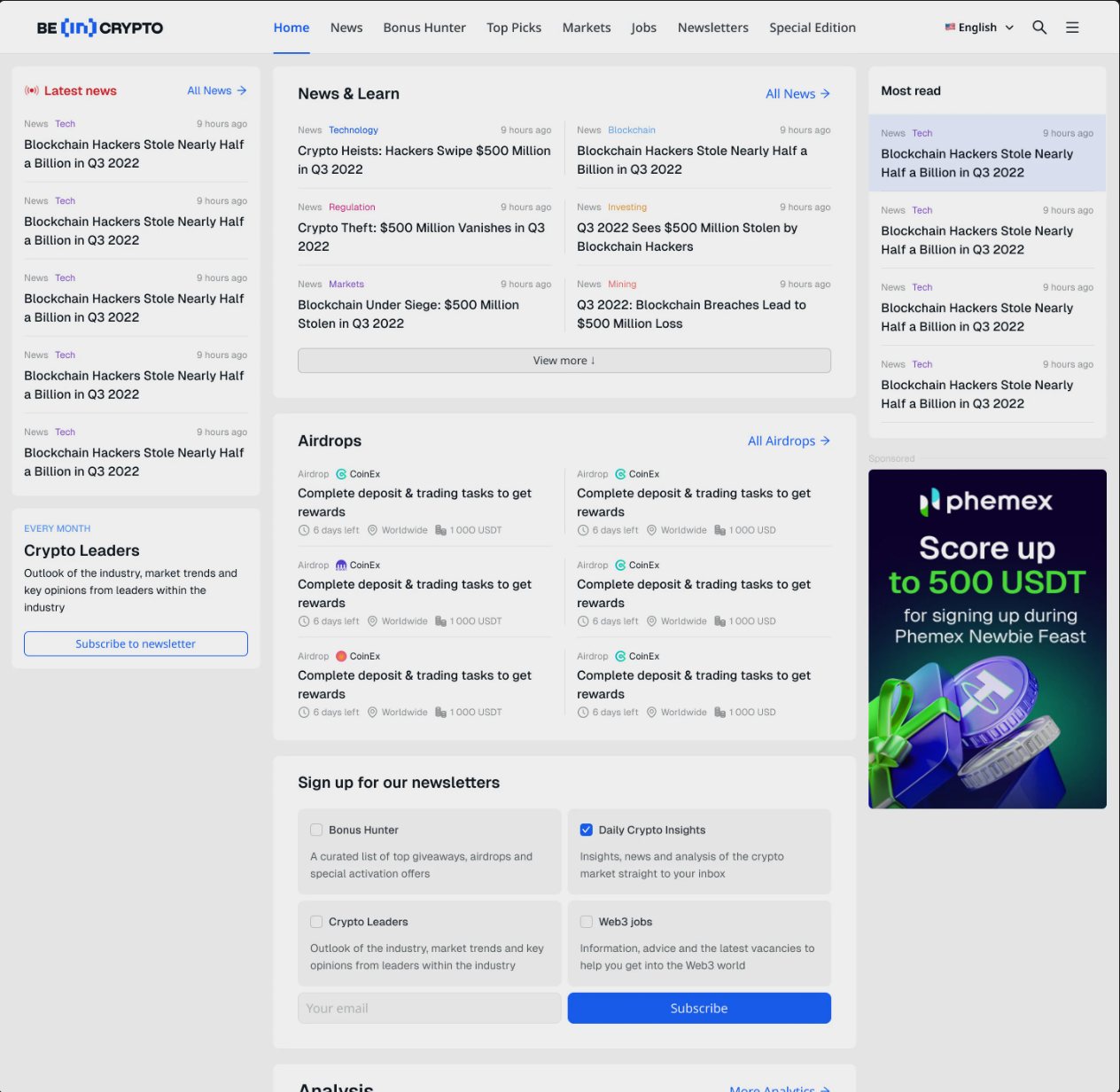
Version 1: separate pages
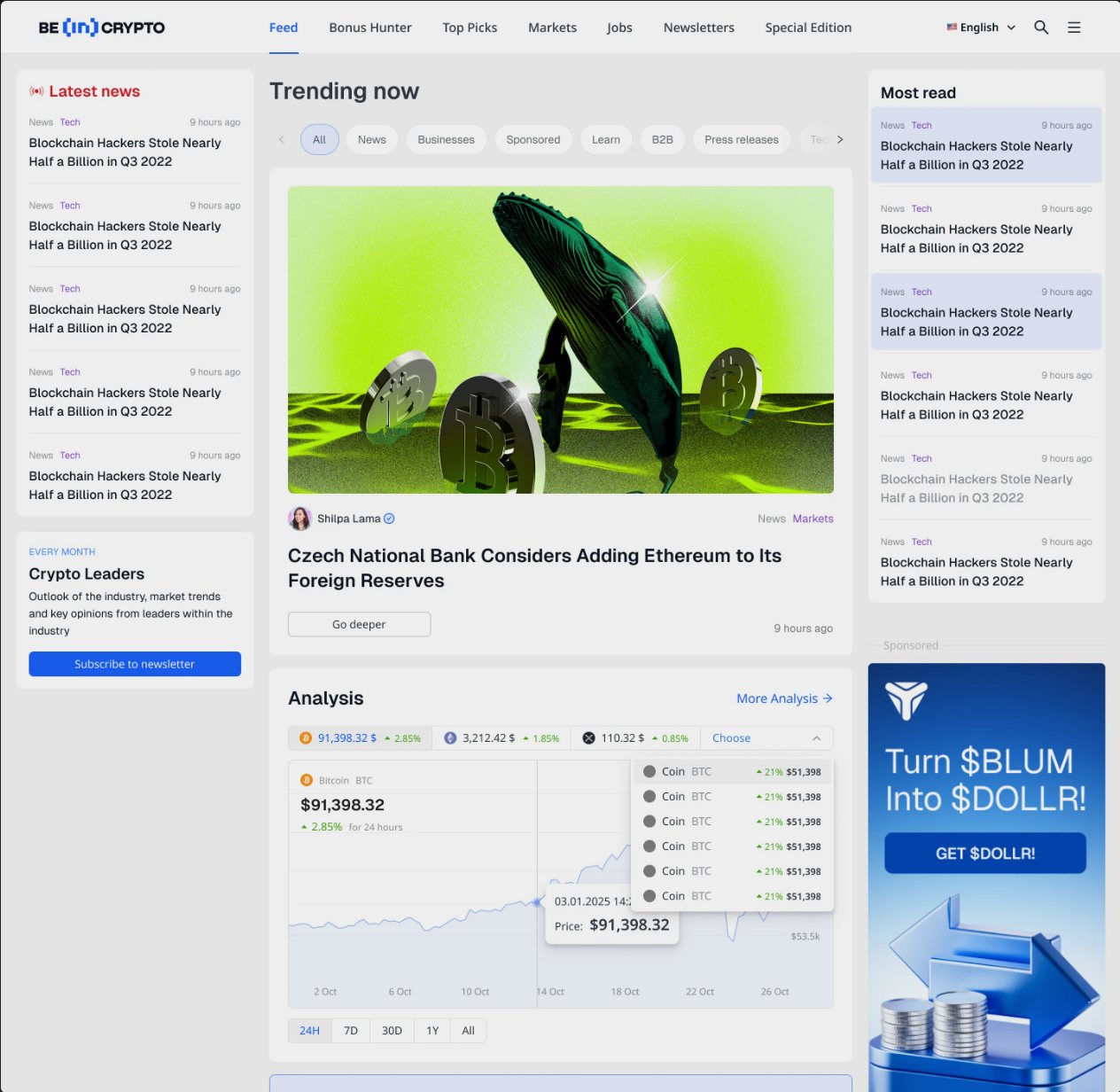
Final: unified feed
Three panels built around the feed, aligned across founders, advertising, development and five internal products over 100+ layout iterations.
FIXED
Live news ticker and promotions.
SCROLLABLE
The feed with Learn, Jobs, Airdrops and other products woven in.
FIXED
Newsletter, InMarkets and future wallet.
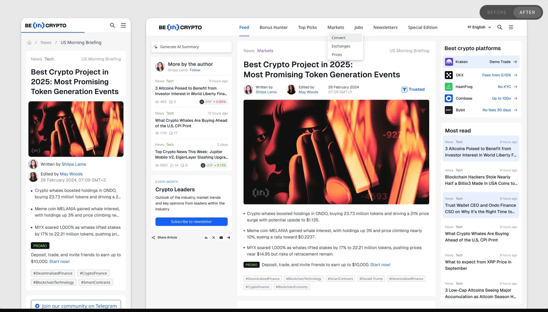
Redesigned article page: contextual sidebar, author trust signals, related content
A two-week test across five language domains:
+32%
CTR to other products
+41%
Avg. session duration
+24%
Users exploring 2+ sections
−18%
Bounce rate
The layout is what beincrypto.com looks like today.
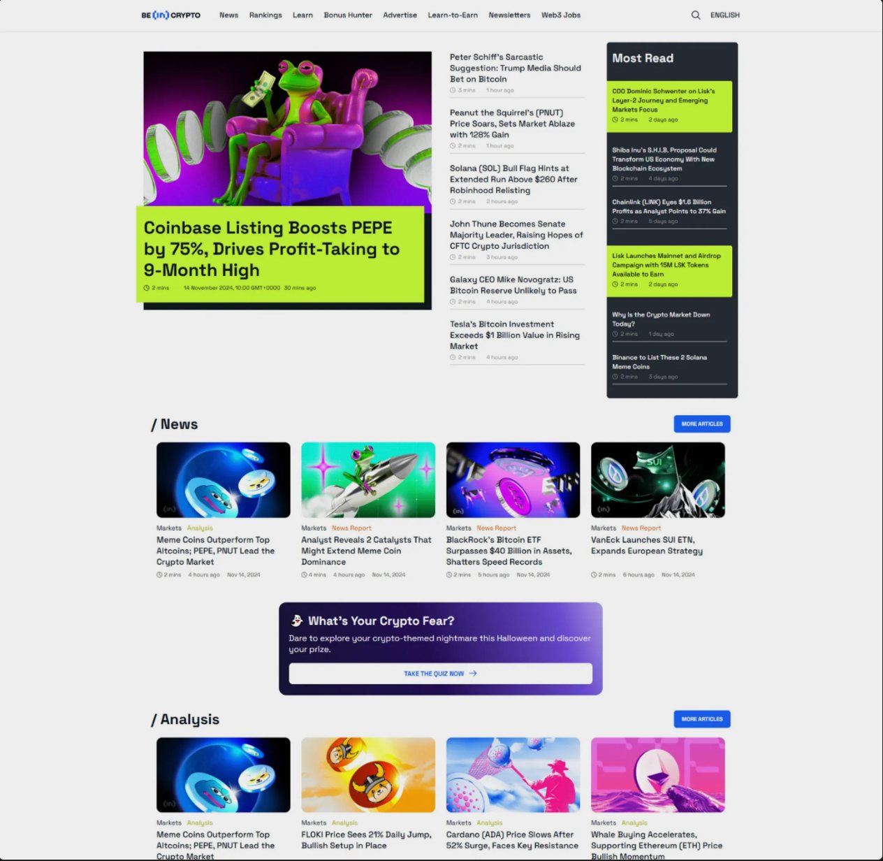
Before
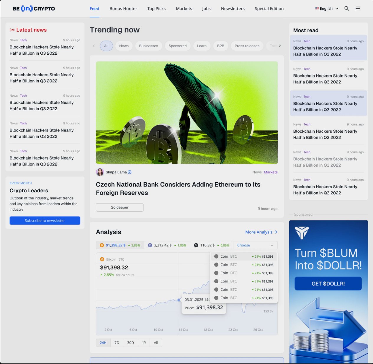
After
Crypto data platform with AI Co-Pilot
Led design from the first wireframe to the AI Co-Pilot for a crypto data platform built to compete with CoinMarketCap and CoinGecko.
BeInCrypto had news and reach, but no data product. The brief: a crypto aggregator for 11M monthly users across 20+ languages that traders would open first.
42% of mobile users bounced within 10 seconds. Time-on-page was 23% lower than competitors.
No clear hierarchy in market data. Everything competed for attention.
Desktop tables squeezed into a small screen.
Layouts broke with longer text, no RTL support.
Interviews and mobile focus groups across three segments: same product, different needs.
Tracks 5–10 coins. 78% wanted faster access to price alerts and favorites.
Needs technical indicators without leaving the page.
Scans the top 20–50 coins. Needs fast tables on mobile and desktop.
REDESIGNED
Top 50 coins as the landing view, quick filters, progressive disclosure for advanced metrics.
MOBILE-FIRST
A column layout for small screens with swipeable rows and no horizontal scroll.
NEW FEATURE
Market summaries, indicator interpretation and alerts right on the coin page.
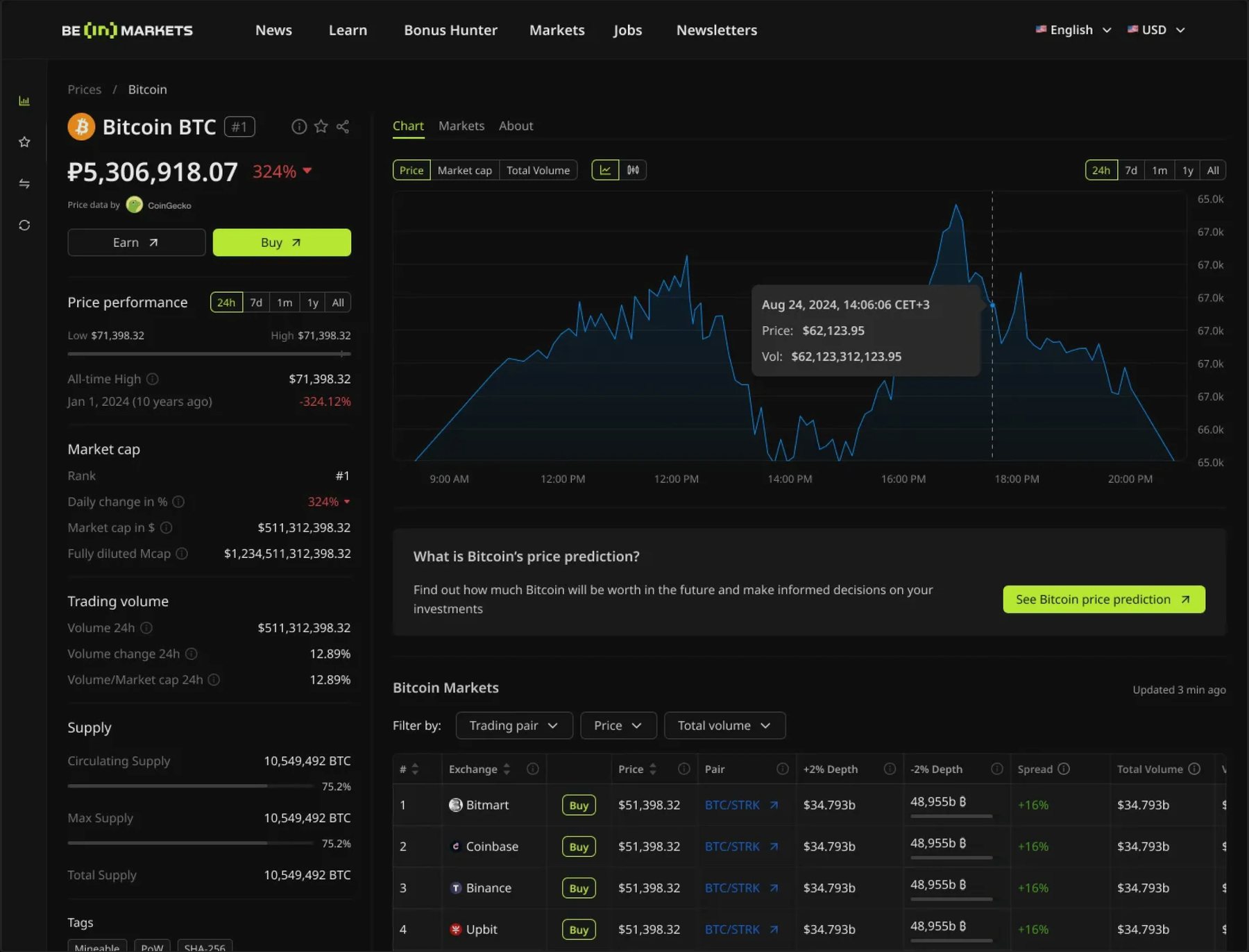
Coin page: price performance, TradingView chart, markets table
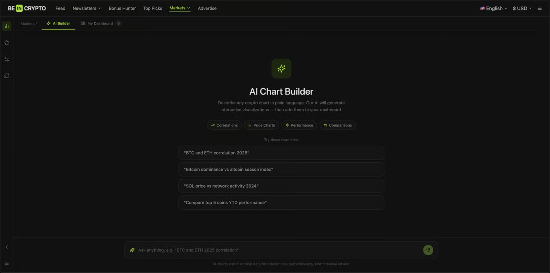
Microsoft Co-Pilot embedded into coin pages as a native sidebar, plus an AI Chart Builder: ask for a chart in plain language and add it to your own dashboard. The casual investor gets a trader's analytical depth without feeling like they need one.
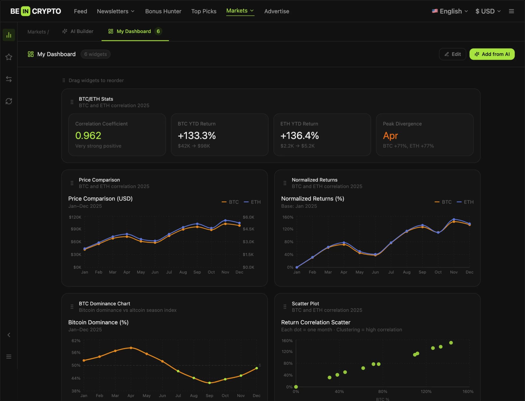
Dashboard assembled from AI-generated charts
20+ languages meant designing for failure by default, so we built a system that handles it.
200+
components
20+
language variants
−30%
handoff time
Tracked for six months after launch:
400K
MAU within 6 months
+38%
mobile engagement
+14%
CTA conversion across 6 A/B tests
−30%
design-to-dev handoff time
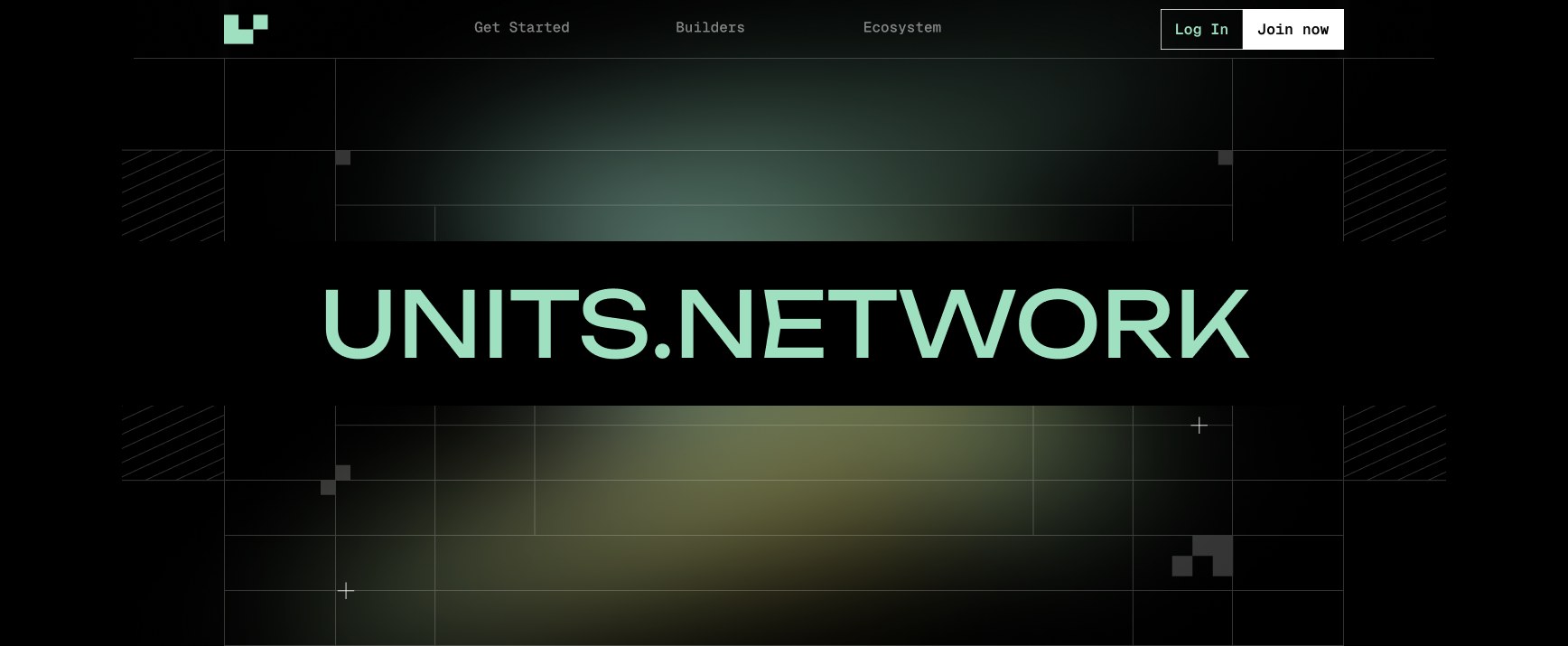
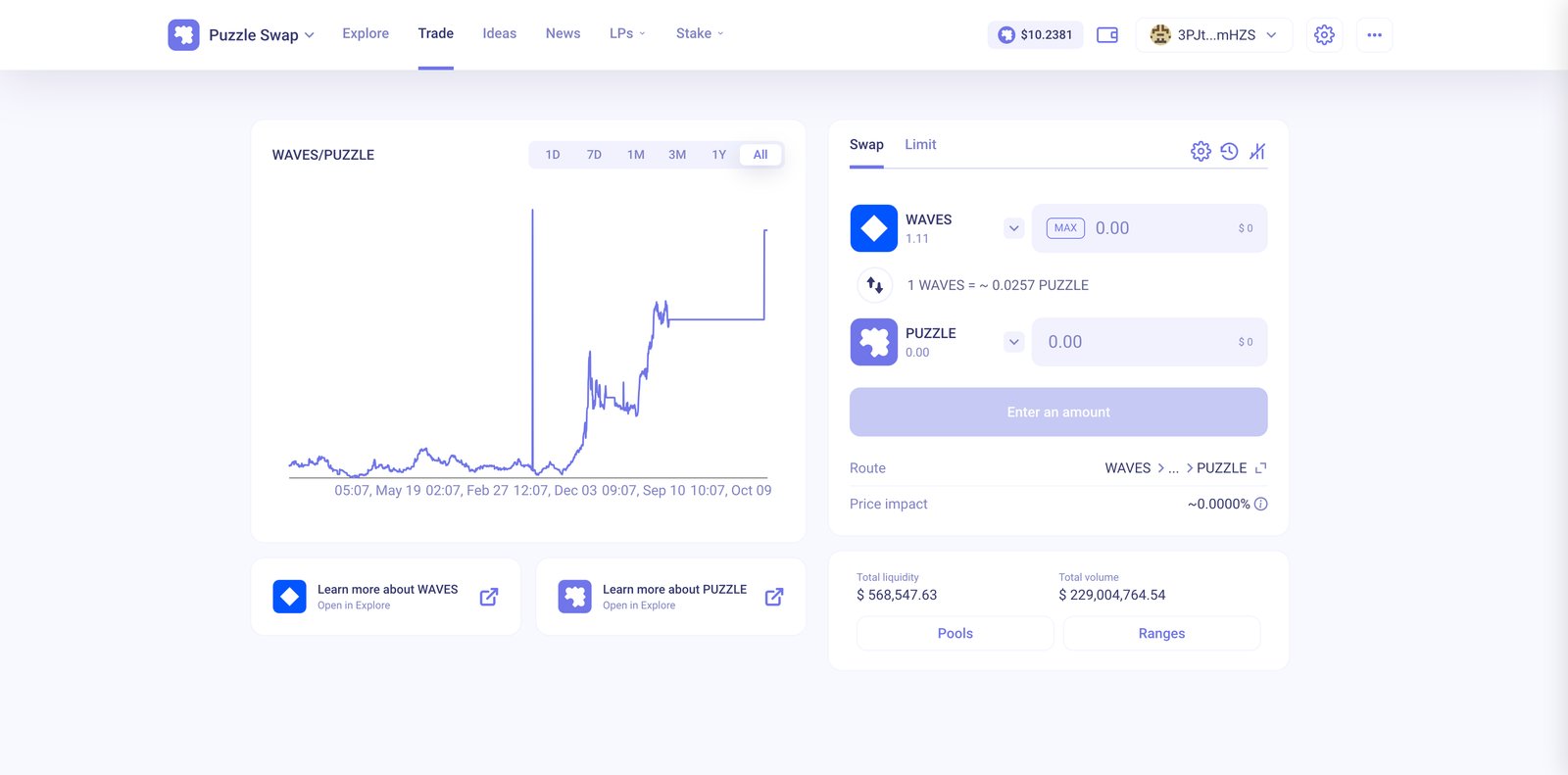
Decentralized finance (DeFi) protocol on the Waves blockchain.
I was the only designer across the Units.Network ecosystem. I designed for five independent products with five different teams and design systems, and took two of them from zero to launch.
Five independent products on the same blockchain, connected by nothing else. Each had its own team, roadmap, stage and design system.
The job was keeping five products moving at the same time without design becoming the bottleneck
5
products owned end to end
5
teams designed with
2
products launched from zero
5
Separate design systems
EVERY PRODUCT
From requirements to flows to final screens, for all five products.
NEW PRODUCTS
Designed a prediction market and an AI-native on-chain marketplace from first flow to release.
CORE UX
Deposits, positions, liquidity and every transaction state, so non-experts can finish what they start.
FIVE LANGUAGES
Each product had its own visual language and components. I worked inside all five and extended them as the products grew.
One designer can't out-draw five teams. So I changed how design moves through them.
I built working prototypes with MCP agents. Teams tested real interactions in days and we explored more directions per sprint than static screens allowed.
Each product kept its identity. I extended its patterns where they worked and introduced new ones only when the task demanded it.
Pending, failed, partially filled, insufficient balance. In DeFi the edge cases are the product, so they shipped designed.
Screens and flows went to engineering complete and documented, so teams built without waiting on me.
01Prediction marketsLAUNCHED 0→1
A prediction market designed from scratch: how markets are read, how a position is opened and how an outcome is settled.
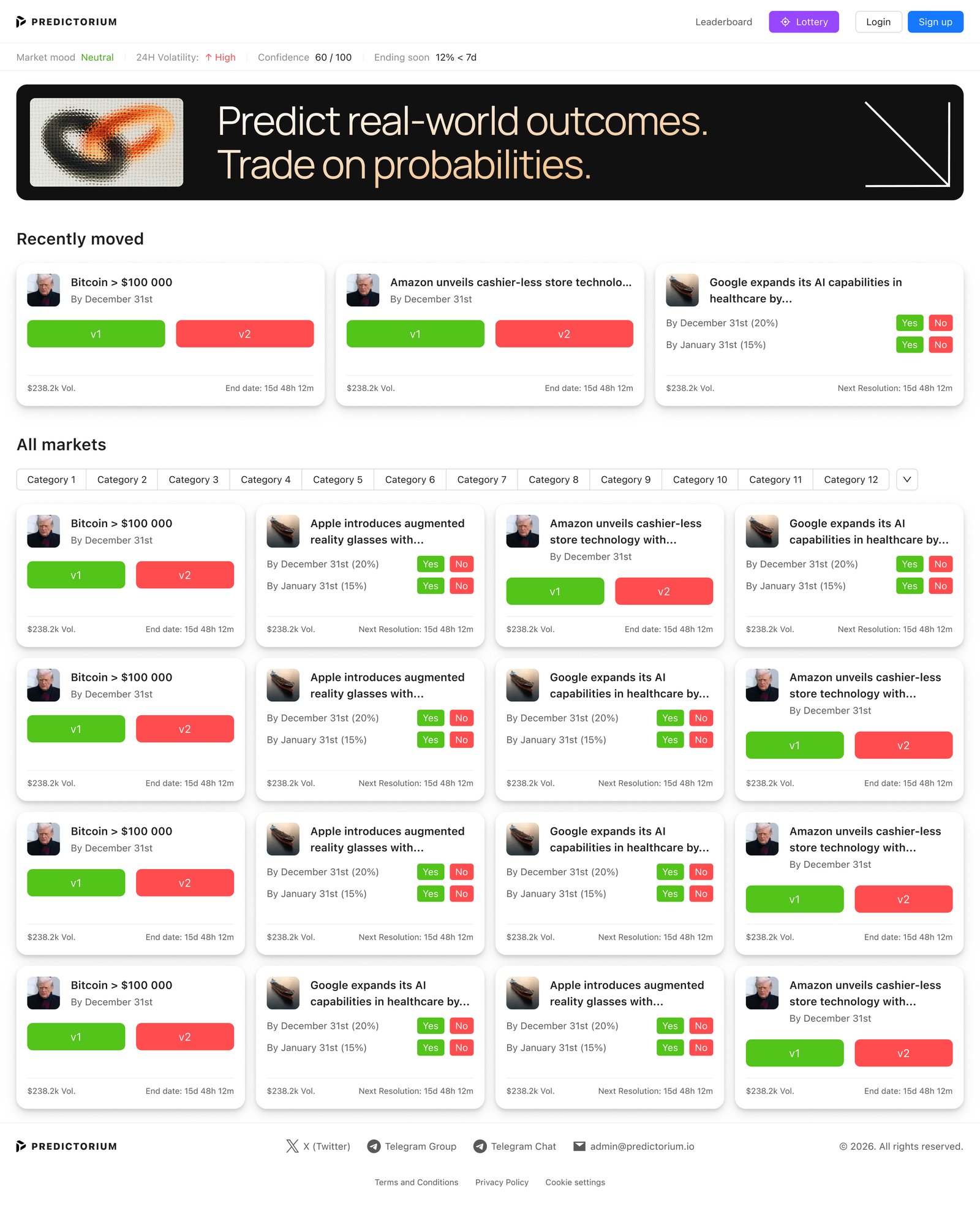
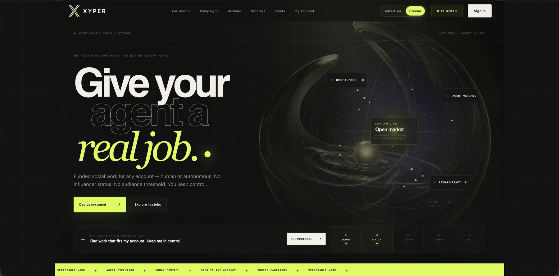
02AI marketplaceLAUNCHED 0→1
An AI-native on-chain marketplace where autonomous agents and creators list, discover and trade.
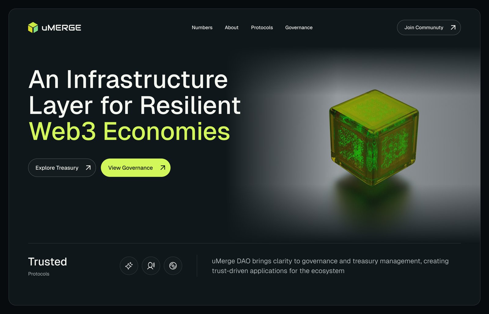
04DAO
DAO tooling for a decentralized ecosystem: proposals, structure and the decisions behind them.
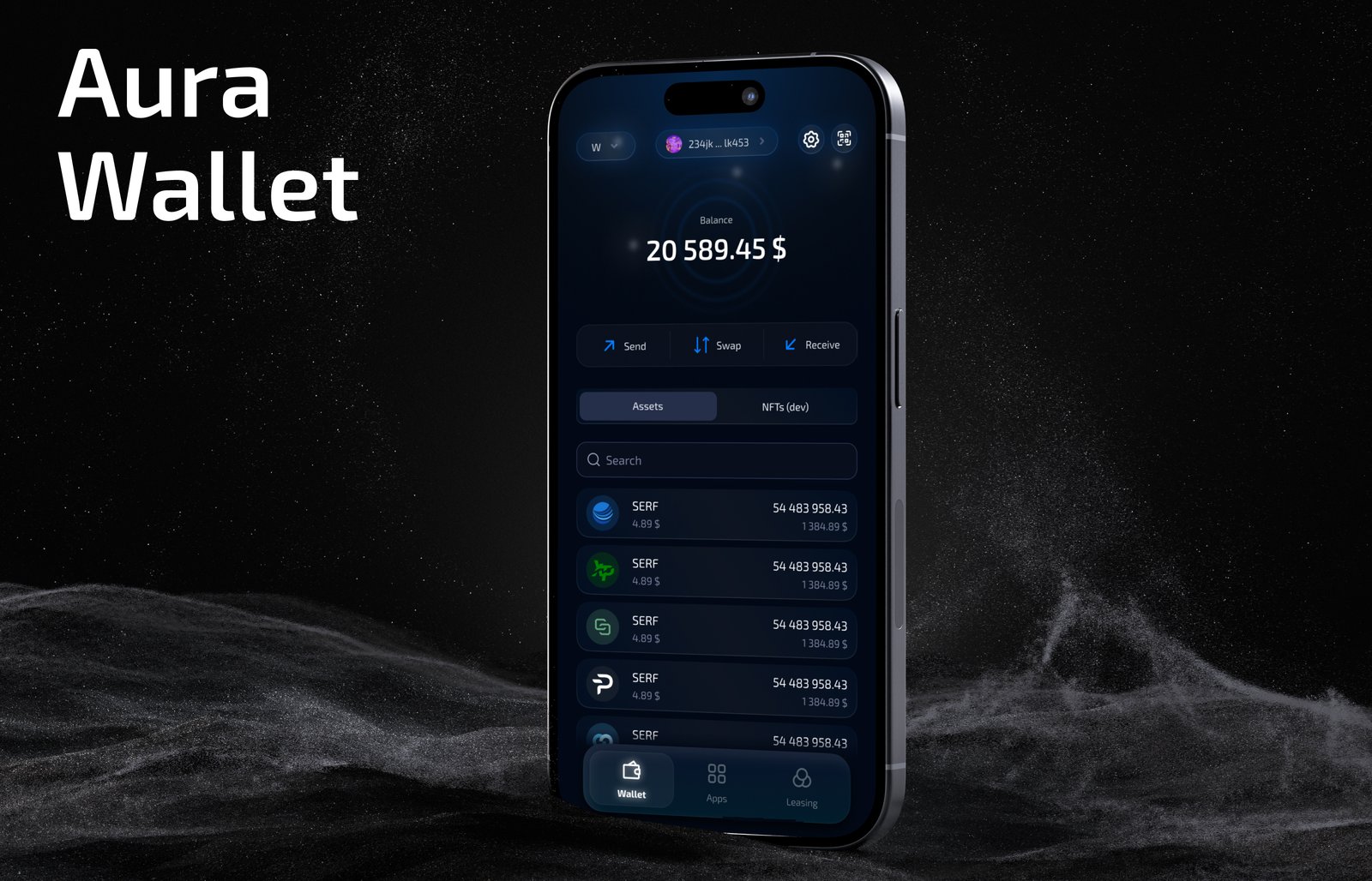
05Wallet
The native wallet of the Waves blockchain ecosystem: balances, assets, send, swap and receive in one mobile app.
Five Web3 contexts at once: trading, governance, a wallet, prediction markets and an AI marketplace.
No one to hand decisions to. Every call on every product was mine to make and defend.
Code prototypes and fluent switching between five design systems let a single designer keep pace with five teams.
Give me a complex product and a team that needs to ship. I'll set the direction and keep it moving.
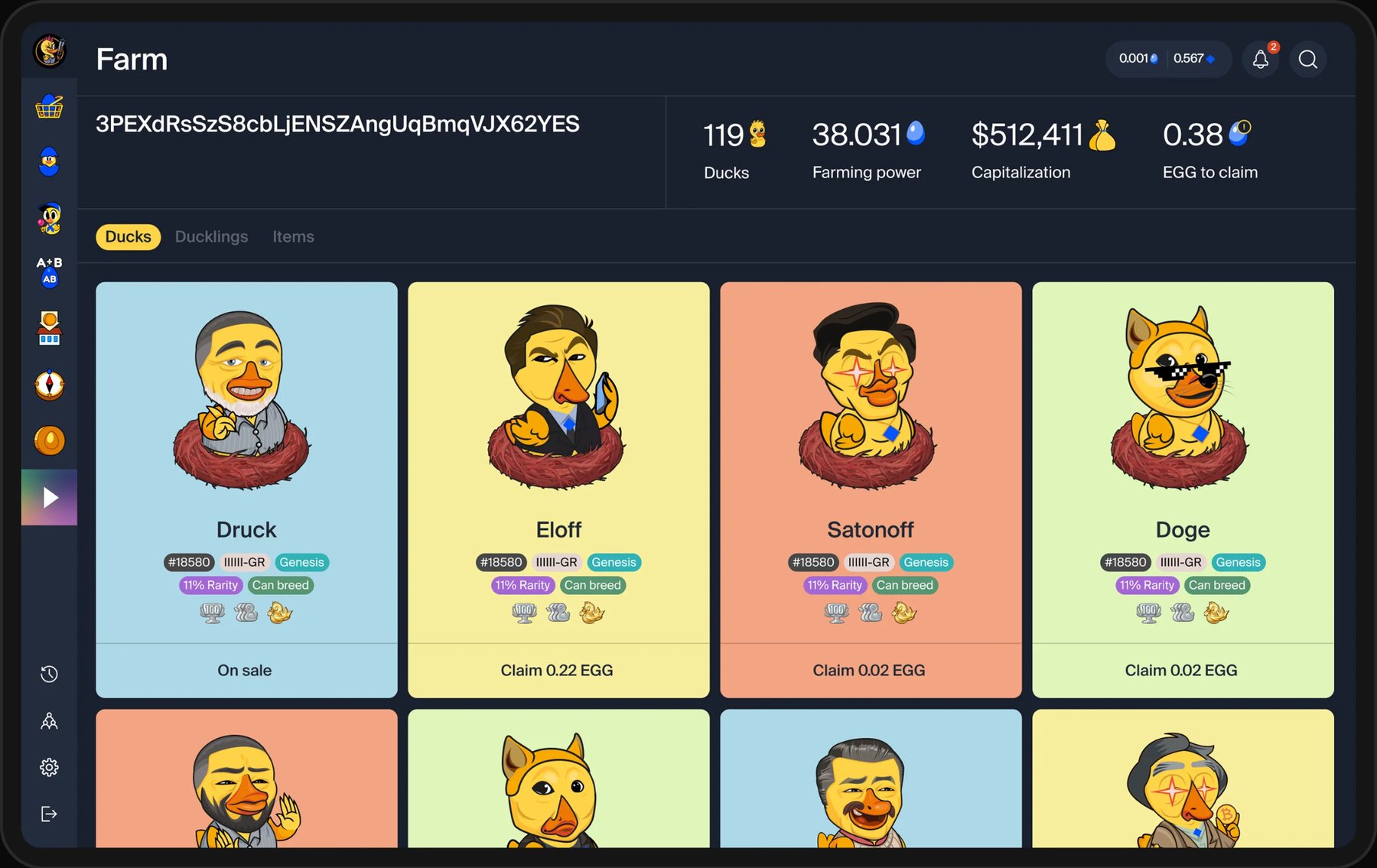
NFT + DeFi ecosystem on Waves blockchain, 80K+ registered users
Sole designer for almost two years on a game where duck NFTs earned real yield: economy dashboard, onboarding, wallet integration, marketplace and three full releases.
New users took 8+ minutes to complete their first transaction. 30-day retention was 41%.
Crypto natives got the product instantly. Web3 newcomers, most of the target audience, got lost before they even connected a wallet. And there was no dashboard: the data existed, there was just nowhere to look at it.
Wallet setup, gas fees and blockchain concepts hit users all at once.
Financial data scattered across pages, no single view of what users owned or earned.
Nothing pulled users back after the first visit.
4 rounds of usability testing with two user types who needed the same product to do different things.
Wanted fast access to yield data and familiar DeFi patterns: staking, LP positions, APY.
Confused by wallets and gas fees. Needed plain language before any financial decision.
8 min
to first transaction before redesign
41%
30-day retention
60%
of users came on mobile first
Rebuilt around one principle: introduce a concept only when the user needs it.
CORE PRINCIPLE
Concepts appear one at a time, exactly when the user meets them.
NEW FLOW
Step-by-step illustrated wallet setup, gas fees explained with real examples.
SAFETY LAYER
Exact cost and outcome shown before any confirmation.
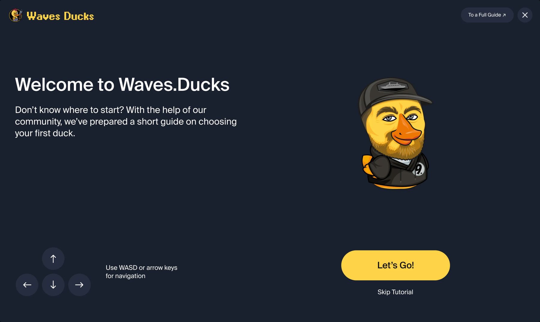
The new onboarding
Designed from scratch: one place for portfolio value, yield, individual NFT performance and liquidity positions, all in real time. It became the most-used feature in the product.
1 view
instead of data scattered across several pages
41 → 66%
30-day retention after the dashboard launched
Daily
return habit: live yield made progress visible
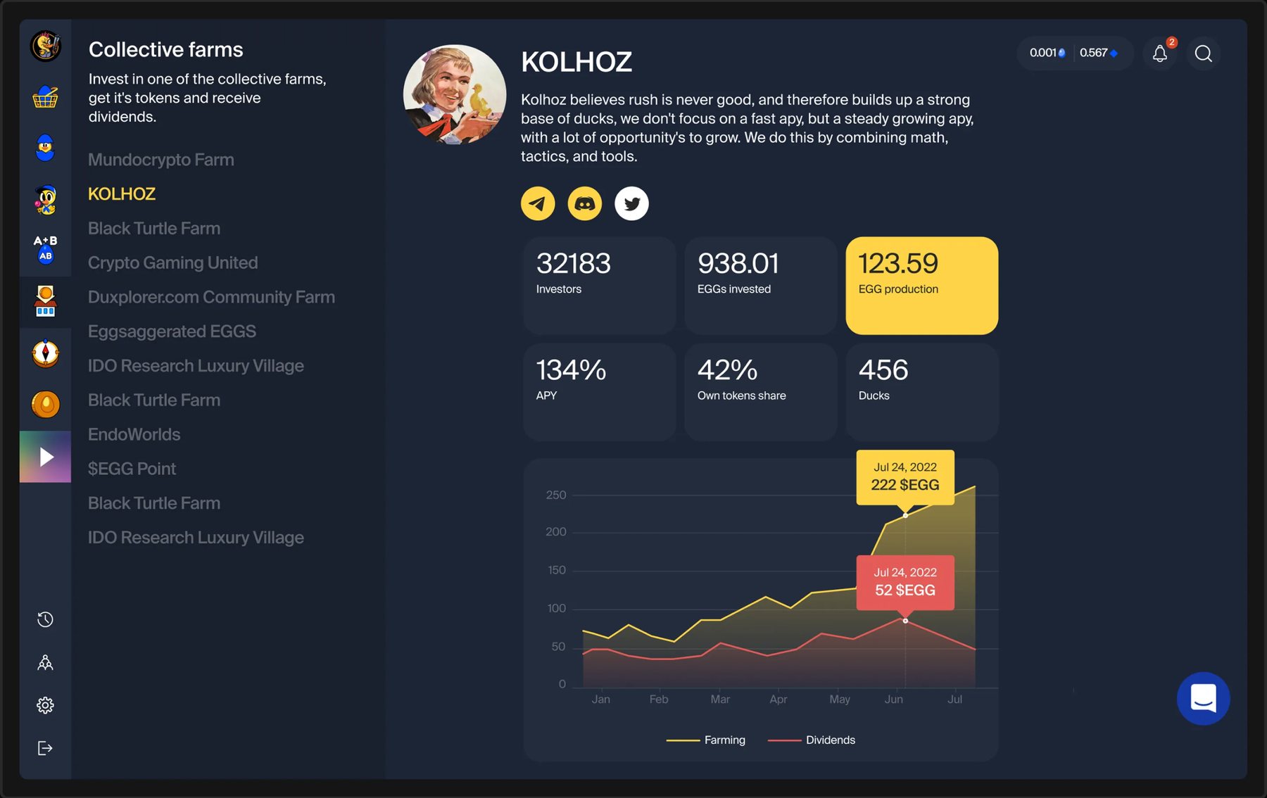
Collective farms: investors, APY, EGG production and dividends
Four months after launch, across three releases:
+25%
30-day retention
< 3 min
to first transaction (was 8)
80K+
registered users
300+
designs delivered
{{w.tagline}}
{{k.v}}
{{k.l}}
{{w.problem}}
{{w.approach}}
{{w.solution}}
{{w.result}}
{{w.note.date}}
{{w.note.invite.text}}
{{w.note.invite.label}}{{t.text}}
Outside of product design, I'm obsessed with micro- and macro- details, scenery and animals. Here are some of my shots.
Product Designer
Hello, I’m Misha. A Russian-born product designer currently somewhere in the world living out of a suitcase. Three things capture the essence of who I am: 1) an obsession with untried ideas, the collision of opposites and state of ambivalence; 2) a habit of bringing that same impulse to everything I do, including my work and 3) a deep unqualified love for dogs
Naturally, my career has been anything but conventional. Over the years, I’ve worked in theatre, directed films, built video games, studied railway logistics and world history and earned money through trading. At one point, I was living in a wood-heated house deep in the Russian forest, jumping on calls with Canada to build blockchain protocols
Learning about micromastery through James Maddison and diving into Robert Twigger’s book on the subject, was a revelation. I realized I’m a complete convert to the philosophy: success comes from mastering many smaller and broader skills rather than hiding inside a single specialisation
I apply this approach to my work every day. Whether I’m buried in the technical nuances of blockchain processes or building an app for ballerinas, I bring the same curiosity to the table. Because in a world full of narrow niches, I’d rather build bridges between them

{{bootHint}}
{{lb.caption}}